Moosehead
I worked with
Conflict
I worked on
Brand Identity
Packaging
Moosehead Lager is one of Canada’s most storied and beloved beers. For decades, the brand was known to Canadians as the domestic beer in the green import-style bottle, which set them apart from their brown-glass competitors. The renewed brand identity combines historical typographic references with a modern sensibility to appeal to both new and old Moosehead drinkers, ensuring the brand’s longevity, legacy, and a strong shelf presence for years to come.


The brand’s most signifigant asset, the moose, was redrawn to make it even more reflective of the brand’s courageous spirit and to increase a semse of connection between the animal and the drinker. The packaging hierarchy is restructured to bring greater emphasis to the beer’s majestic namesake and reintroduce a strong use of gold as well as a richer, more vibrant emerald green.


Various Projects
Autograph“When we sign our name, it means something.”
MidlandA Beautiful Fit.

Longo’s Private LabelHigher Standards on Every Shelf.
StaplesThe Working and Learning Company.
MooseheadThe New Moosehead.
EssentialsCheckity, Check, Check, Check, Check.

Longo’sThe Highest Standards Are Family Standards.
MOXIESA New Era of MOXIES.
The Fox & FiddleThe Traditional Pub Identity Reimagined for Urban Life.
Source for SportsWe Fit Your Game.

Kensington HealthGiving New Meaning to Community Care.
FRIDAYSReinventing the FRIDAYS 360º Customer Experience.

CuratoItaly’s best.
BrimBrim With Potential.

Longo’s Meal KitsCook-in is the New Take-out.

RMRKBLAverage is Over.
Black & McDonaldMake it Right.

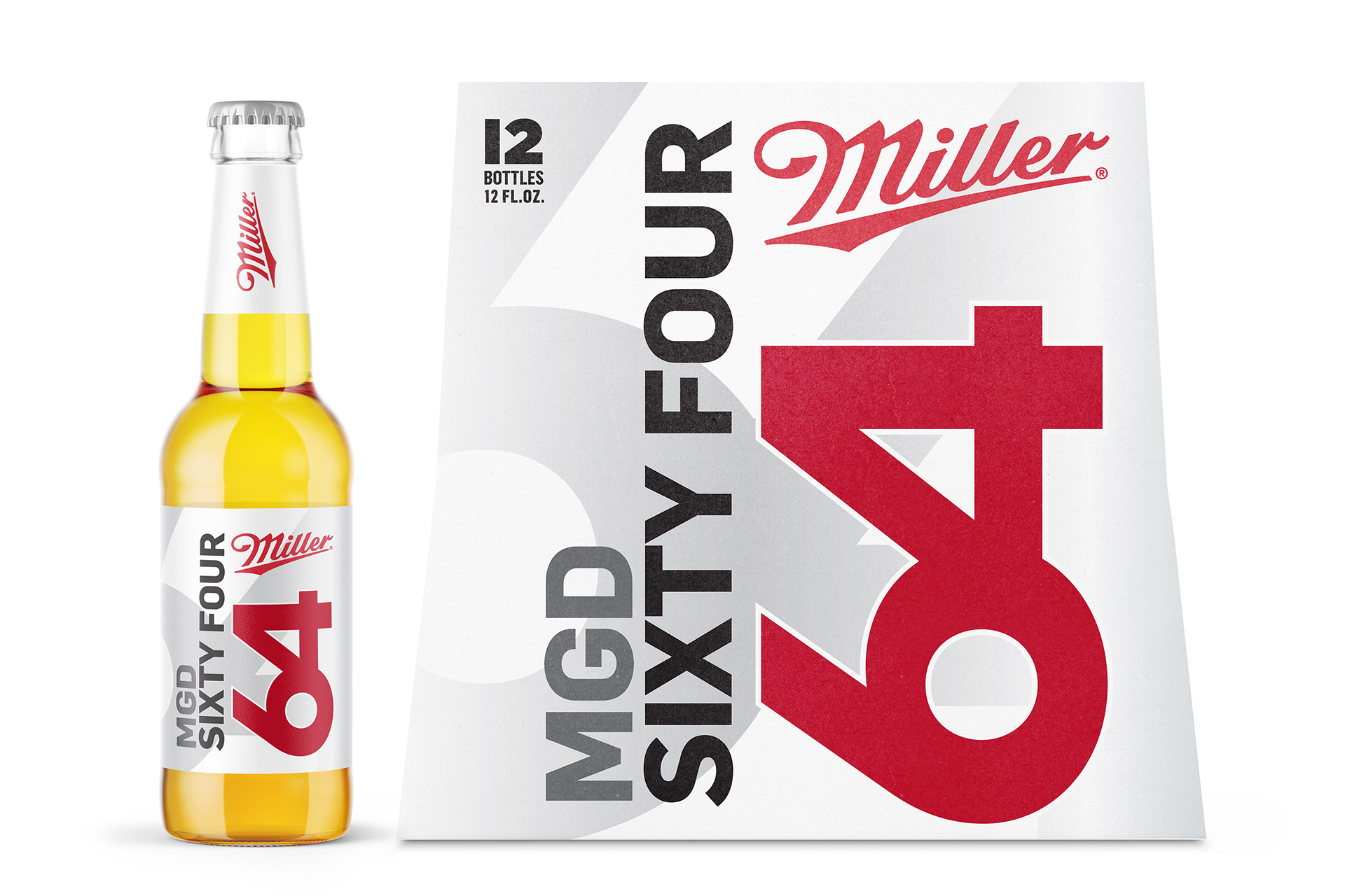
MIller 64Light Beer You Can Feel Better About.

Coors PeakCoors Peak, the Naturally Great Beer.

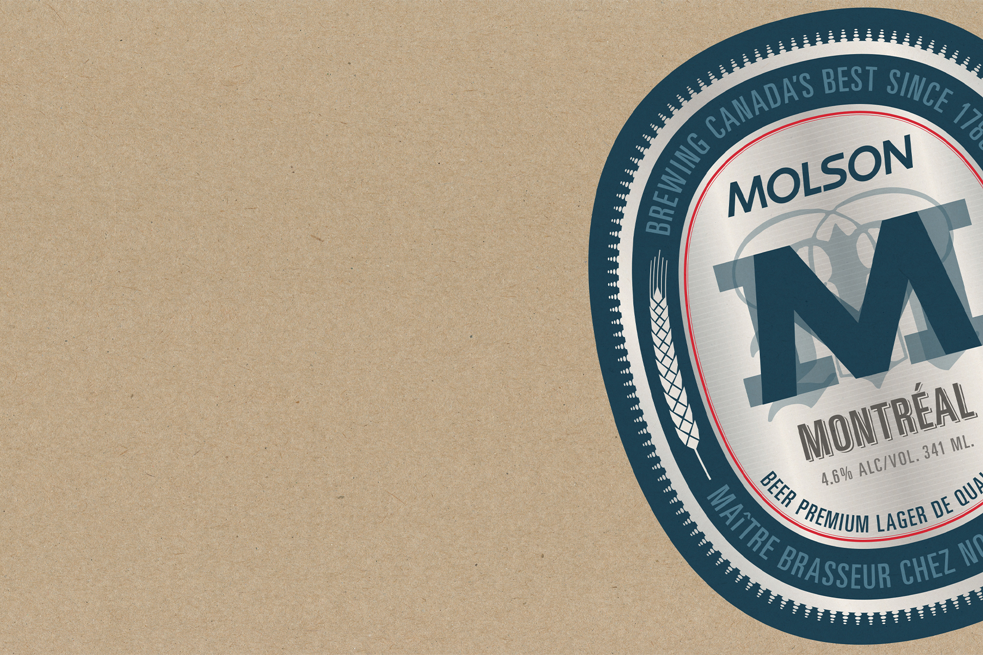
Molson MontréalWhere Good Things Come Together.
Canadian Tire Private LabelCanvas, Frank, OE Plus, Yardworks.
Chartered Accountants of OntarioWe Want Your Brain.
BrandmarksVarious identities.
Christian Hanson
Strategic Direction
& Design ©2025